
In this project my aim is to play with the selected datasets, generate plots and animations and improve my data visualization skills.
- Plot daily/cumulative data** of signle country;

- Plot color filled single country plot with cases & deaths together;

- Plot comparative daily/cumulative data** of multiple countries;

- Plot comparative daily/cumulative N-days running averaged data** of multiple countries;

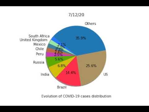
- Plot a pie chart of the data*;

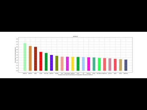
- Plot a bar chart of data*** w.r.t. country population;

- Generate an animation of a pie chart of the data** from Jan to today;
- Generate an animation of a bar chart of the data*** from Jan to today;


(**) Refers to: confirmed, deaths and recovered cases
(***) Refers to: confirmed, deaths and recovered cases + usage of population data
- COVID-19 Data Repository by the Center for Systems Science and Engineering at Johns Hopkins University (CSS JHU repository)
- Population by country 2020 from the Kaggle website
- Code of the project available in two versions: .py & .ipynb (it is suggested to work on Google Colaboratory as I did and it is guaranteed to work);
- A local copy of the population dataset that for simplicity is in this repository to be automatically imported while running the code;
- README.md file and the images used for this presentation;